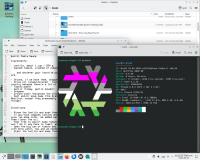
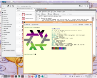
Before...

...and after.

Gonna try and talk through what's happening here.
Windows
Among the themes in the KDE store – or rather, pling dot com? – are Commonality by phob1an, inspired by SGI's Common Desktop Environment.
We chose not to use this fully – we didn't like it all being colored like that – but we did set it as our Window Decorations. What this did is make the interesting bar styling for the frames of the windows (at least, the non-GTK ones) that was also somehow more compact than what we had before. And had a really clear (for us, in color) distinction between active and inactive windows, in a way we liked.
However, we left the global theme on Breeze, the default light-mode, because we do like light mode for Evergreen (the computer we're customizing). We didn't have enough energy to go deep into colors yesterday, so we left that part at dialing in a nice pink-purple highlight color that went well with the orange in our eyes.
Desktop image
We originally weren't gonna change it – we had a cute picture of fat birds by Shazzbaa – but we were thinking about how we could match the color scheme and saw a lovely picture by Qinni on Deviantart (RIP). It doesn't seem to be up any more, but a tiny animated-GIF version of "Timeless Sleep" still exists if you want a sense of the general appearance.
Konsole
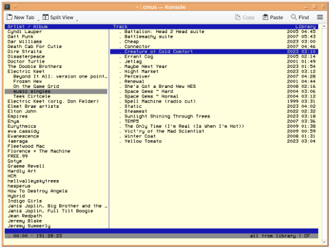
We actually made our own light-mode color scheme for Konsole a while ago (coincidentally, using a similar yellow colorscheme), but it had issues with legibility in programs like cmus. Yesterday, we realized this was because we set the 'white' color to be quite dark, and the program was assuming that would contrast well with other colors in the palette - so we lightened that significantly, and it became much more usable.

The contrast degrades right back down when we hit Play and it switches to yellow for the text, but there's only so much we can do. It looks great in nano and bsdgames.
Anyway, we ran through hyfetch configuration again a few times, settling on 60% lightness. For logo ANSI art purposes, it was contrasty enough for us.
Oh, and we switched to Bedstead for the font – same one we were using in KWrite. It looks nice.
Firefox
Ugggh, some apps just don't care. Or maybe we need to figure out a way to do something with – *checks notes* – GTK? Who knows.
Anyway, we put a moon on it just so it'd have something.
Edit 08-26: We went into "Customize toolbar..." and there was a "Title Bar" tickbox that made it match. Did not expect that.
Customizing takes a lot longer than we expected. But also it turns out we had a lot more ability to decide what we wanted than we feared. And it turns out we do like customizing it a bit.